hexo博客butterfly主题美化教程
写在前面:
- 博客魔改有风险,建议在修改代码时,将原代码注释而不是删除
- 鉴于每个人的根目录名称都不一样,本帖博客根目录一律以
[BlogRoot]指代- 因为
.pug、.styl和.yml文件对于缩进的要求较为严格,故建议大家使用VS Code进行修改- 本帖的部分代码以diff代码块标识,在修改时别忘记删去前面的
+和-符号
网站恶搞标题
效果预览
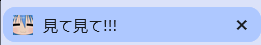
在未选中该网页时,其呈现出这样的内容
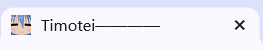
在选中该网页的一段时间内,其呈现出这样的内容,之后恢复正常
修改方式
新建文件
[BlogRoot]\source\js\title.js,写入以下内容:1
2
3
4
5
6
7
8
9
10
11
12
13
14
15
16
17//动态标题
var OriginTitile = document.title;
var titleTime;
document.addEventListener('visibilitychange', function () {
if (document.hidden) {
//离开当前页面时标签显示内容
document.title = '見て見て!!!';
clearTimeout(titleTime);
} else {
//返回当前页面时标签显示内容
document.title = 'Timotei————';
//两秒后变回正常标题
titleTime = setTimeout(function () {
document.title = OriginTitile;
}, 2000);
}
});别忘了在主题配置文件里面引入该内容:
1
2
3
4
inject:
head:
bottom:
+ - <script async src="/js/title.js"></script>最后重启该项目(该步骤以后不再赘述)
1
hexo cl; hexo g; hexo d
头像呼吸灯
效果预览
在头像周围加上一圈白色的呼吸灯
修改方式
这个呼吸灯可以通过js实现,也可以通过css实现。使用css实现的性能会好一点。所以可以在 [BlogRoot]\source\css\custom.css里面添加如下代码(没有就自己新建一个)。其中关于颜色、时间的部分大家都可以按照自己的喜好来调节。原理挺简单的,就是关键帧之间通过某个插值方法连续变样式而已,会这一个你就会DIY各种高大上的动画啦~
1 | /* 头像呼吸灯 */ |
重启项目即可看到效果。
文章页顶波浪线
效果预览
在文章封面的底部加上一层动态海浪效果,颜色可以自己调
修改方式
修改
[BlogRoot]\themes\butterfly\layout\includes\header\index.pug文件,大概位置在33行1
2
3
4
5
6
7
8
9
10
11
12
13
14
15
16
17
18if top_img !== false
if is_post()
include ./post-info.pug
+ section.main-hero-waves-area.waves-area
+ svg.waves-svg(xmlns='http://www.w3.org/2000/svg', xlink='http://www.w3.org/1999/xlink', viewBox='0 24 150 28', preserveAspectRatio='none', shape-rendering='auto')
+ defs
+ path#gentle-wave(d='M -160 44 c 30 0 58 -18 88 -18 s 58 18 88 18 s 58 -18 88 -18 s 58 18 88 18 v 44 h -352 Z')
+ g.parallax
+ use(href='#gentle-wave', x='48', y='0')
+ use(href='#gentle-wave', x='48', y='3')
+ use(href='#gentle-wave', x='48', y='5')
+ use(href='#gentle-wave', x='48', y='7')
#post-top-cover
img#post-top-bg(class='nolazyload' src=bg_img)
else if is_home()
#site-info
h1#site-title=site_title
if theme.subtitle.enable注意看好缩进
然后在
[BlogRoot]\source\css\custom.css里面添加如下内容1
2
3
4
5
6
7
8
9
10
11
12
13
14
15
16
17
18
19
20
21
22
23
24
25
26
27
28
29
30
31
32
33
34
35
36
37
38
39
40
41
42
43
44
45
46
47
48
49
50
51
52
53
54
55
56
57
58
59
60
61
62
63
64
65
66
67
68
69
70
71
72
73
74/* 波浪css */
.main-hero-waves-area {
width: 100%;
position: absolute;
left: 0;
bottom: -11px;
z-index: 5;
}
.waves-area .waves-svg {
width: 100%;
height: 5rem;
}
/* Animation */
.parallax > use {
animation: move-forever 25s cubic-bezier(0.55, 0.5, 0.45, 0.5) infinite;
}
.parallax > use:nth-child(1) {
animation-delay: -2s;
animation-duration: 7s;
fill: #f7f9febd;
}
.parallax > use:nth-child(2) {
animation-delay: -3s;
animation-duration: 10s;
fill: #f7f9fe82;
}
.parallax > use:nth-child(3) {
animation-delay: -4s;
animation-duration: 13s;
fill: #f7f9fe36;
}
.parallax > use:nth-child(4) {
animation-delay: -5s;
animation-duration: 20s;
fill: #f7f9fe;
}
/* 黑色模式背景 */
[data-theme="dark"] .parallax > use:nth-child(1) {
animation-delay: -2s;
animation-duration: 7s;
fill: #18171dc8;
}
[data-theme="dark"] .parallax > use:nth-child(2) {
animation-delay: -3s;
animation-duration: 10s;
fill: #18171d80;
}
[data-theme="dark"] .parallax > use:nth-child(3) {
animation-delay: -4s;
animation-duration: 13s;
fill: #18171d3e;
}
[data-theme="dark"] .parallax > use:nth-child(4) {
animation-delay: -5s;
animation-duration: 20s;
fill: #18171d;
}
@keyframes move-forever {
0% {
transform: translate3d(-90px, 0, 0);
}
100% {
transform: translate3d(85px, 0, 0);
}
}
/*Shrinking for mobile*/
@media (max-width: 768px) {
.waves-area .waves-svg {
height: 40px;
min-height: 40px;
}
}css里面的fill属性就是控制波浪颜色的,最好让其中一个颜色与背景颜色一致,不然的话看起来会很怪。最后重启该项目即可。
添加fps显示
效果预览
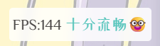
在页面的某个位置(我这里设置的是左下角),添加fps的显示,可以划阶段显示不同文字
修改方式
新建文件
[BlogRoot]\source\js\fps.js,并写入如下代码1
2
3
4
5
6
7
8
9
10
11
12
13
14
15
16
17
18
19
20
21
22
23
24
25
26
27
28
29
30
31
32
33
34
35
36
37
38
39
40
41
42
43
44
45
46
47
48
49
50
51if (window.localStorage.getItem("fpson") == undefined || window.localStorage.getItem("fpson") == "1") {
var rAF = function () {
return (
window.requestAnimationFrame ||
window.webkitRequestAnimationFrame ||
function (callback) {
window.setTimeout(callback, 1000 / 60);
}
);
}();
var frame = 0;
var allFrameCount = 0;
var lastTime = Date.now();
var lastFameTime = Date.now();
var loop = function () {
var now = Date.now();
var fs = (now - lastFameTime);
var fps = Math.round(1000 / fs);
lastFameTime = now;
// 不置 0,在动画的开头及结尾记录此值的差值算出 FPS
allFrameCount++;
frame++;
if (now > 1000 + lastTime) {
var fps = Math.round((frame * 1000) / (now - lastTime));
if (fps <= 5) {
var kd = `<span style="color:#bd0000">卡成ppt😰</span>`
} else if (fps <= 15) {
var kd = `<span style="color:red">电竞级帧率😖</span>`
} else if (fps <= 25) {
var kd = `<span style="color:orange">有点难受😨</span>`
} else if (fps < 35) {
var kd = `<span style="color:#9338e6">不太流畅🙄</span>`
} else if (fps <= 45) {
var kd = `<span style="color:#08b7e4">还不错哦😁</span>`
} else {
var kd = `<span style="color:#39c5bb">十分流畅🤓</span>`
}
document.getElementById("fps").innerHTML = `FPS:${fps} ${kd}`;
frame = 0;
lastTime = now;
};
rAF(loop);
}
loop();
} else {
document.getElementById("fps").style = "display:none!important"
}在
[BlogRoot]\source\css\custom.css中加入如下代码,我这里就是让这个显示在左下角,你可以自己指定位置,其中backdrop-filter过滤器也可以自己指定,也可以不要1
2
3
4
5
6
7
8
9
10
11
12
13
14
15
16
17
18
19
20/* 帧率检测 */
#fps {
position: fixed;
/* 指定位置 */
left: 10px;
bottom: 10px;
z-index: 1919810;
}
[data-theme="light"] #fps {
background-color: rgba(255, 255, 255, 0.85);
backdrop-filter: var(--backdrop-filter);
padding: 4px;
border-radius: 4px;
}
[data-theme="dark"] #fps {
background-color: rgba(0, 0, 0, 0.72);
backdrop-filter: var(--backdrop-filter);
padding: 4px;
border-radius: 4px;
}在主题配置文件
_config.butterfly.yml文件中加入如下代码1
2
3
4
5inject:
head:
+ - <span id="fps"></span> # 帧率检测
bottom:
+ - <script async src="/js/fps.js"></script> # 帧率检测重启项目看看有没有出现帧率块
右边按钮阅读进度
效果预览
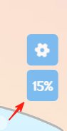
其实是把一键回到页顶给修改了一下。当鼠标没有悬停在这个按钮上的时候,它会显示当前文章的阅读进度;当鼠标悬停在上面的时候,它会显示一个上箭头,点击即可回到页顶
修改方式
其实实现原理也比较简单,我们只要把
被顶部卷去的高度/(页面总高度 - 可视高度),就能算出百分比啦!之所以减去可视高度,是因为当我们在滑倒最底部的时候,可以看出页面高度 = 被卷去的高度 + 可视高度
修改文件
[BlogRoot]\themes\butterfly\layout\includes\rightside.pug,在最下面插入如下两行代码1
2
3
4button#go-up(type="button" title=_p("rightside.back_to_top"))
i.fas.fa-arrow-up
+ span#percent 0
+ span %新建文件
[BlogRoot]\source\js\readPercent.js,加入如下代码1
2
3
4
5
6
7
8
9
10
11
12
13
14
15
16
17
18
19
20
21
22
23
24
25
26
27
28// 当窗口滚动时,执行 percent 函数
window.onscroll = percent;
// 页面百分比函数
function percent() {
// --- 计算滚动百分比 ---
let scrollTop = document.documentElement.scrollTop || window.pageYOffset;
let scrollHeight = Math.max(document.body.scrollHeight, document.documentElement.scrollHeight) - document.documentElement.clientHeight;
let result = Math.round(scrollTop / scrollHeight * 100);
// 直接通过 class 获取箭头元素,更可靠
const arrow = document.querySelector("#go-up .fa-arrow-up");
const percentEl = document.querySelector("#percent");
// 如果找不到元素,就直接退出,防止报错
if (!arrow || !percentEl) {
return;
}
if (result >= 95) {
arrow.style.display = 'block';
percentEl.style.display = 'none';
} else {
arrow.style.display = 'none';
percentEl.style.display = 'block';
// 在更新数字的同时,加上 '%' 号
percentEl.innerText = result + '%';
}
}创建文件
[BlogRoot]\source\css\readPercent.css,写入如下代码1
2
3
4
5
6
7
8
9
10
11
12
13
14
15
16
17
18
19
20
21/* 返回顶部 */
button#go-up #percent {
display: none;
font-weight: bold;
font-size: 15px ;
}
button#go-up span {
font-size: 12px;
margin-right: -1px;
}
/* 鼠标滑动到按钮上时显示返回顶部图标 */
button#go-up:hover i {
display: block ;
}
button#go-up:hover #percent {
display: none ;
}最后记得引入一下js和css文件
1
2
3
4
5
inject:
head:
+ - <link rel="stylesheet" href="/css/readPercent.css">
bottom:
+ - <script defer data-pjax src="/js/readPercent.js"></script>重启项目即可看到效果
鼠标魔改
因为截图截不到鼠标所以这里就不放效果图了,具体说来是把你的鼠标变成上下两层圆,上层圆小一点,是你的鼠标本体;下层圆大一点,颜色淡一点,会追随你的鼠标移动。
修改方式
新建文件
[BlogRoot]\source\js\cursor.js,在里面加入如下代码1
2
3
4
5
6
7
8
9
10
11
12
13
14
15
16
17
18
19
20
21
22
23
24
25
26
27
28
29
30
31
32
33
34
35
36
37
38
39
40
41
42
43
44
45
46
47
48
49
50
51
52
53
54
55
56
57
58
59
60
61
62
63
64
65
66
67
68
69
70
71
72
73
74
75
76
77
78
79
80
81
82
83var CURSOR;
Math.lerp = (a, b, n) => (1 - n) * a + n * b;
const getStyle = (el, attr) => {
try {
return window.getComputedStyle
? window.getComputedStyle(el)[attr]
: el.currentStyle[attr];
} catch (e) {}
return "";
};
class Cursor {
constructor() {
this.pos = {curr: null, prev: null};
this.pt = [];
this.create();
this.init();
this.render();
}
move(left, top) {
this.cursor.style["left"] = `${left}px`;
this.cursor.style["top"] = `${top}px`;
}
create() {
if (!this.cursor) {
this.cursor = document.createElement("div");
this.cursor.id = "cursor";
this.cursor.classList.add("hidden");
document.body.append(this.cursor);
}
var el = document.getElementsByTagName('*');
for (let i = 0; i < el.length; i++)
if (getStyle(el[i], "cursor") == "pointer")
this.pt.push(el[i].outerHTML);
document.body.appendChild((this.scr = document.createElement("style")));
// 这里改变鼠标指针的颜色 由svg生成
this.scr.innerHTML = `* {cursor: url("data:image/svg+xml,<svg xmlns='http://www.w3.org/2000/svg' viewBox='0 0 8 8' width='8px' height='8px'><circle cx='4' cy='4' r='4' fill='%23F2A3FE' opacity='.5'/></svg>") 4 4, auto}`;
}
refresh() {
this.scr.remove();
this.cursor.classList.remove("hover");
this.cursor.classList.remove("active");
this.pos = {curr: null, prev: null};
this.pt = [];
this.create();
this.init();
this.render();
}
init() {
document.onmouseover = e => this.pt.includes(e.target.outerHTML) && this.cursor.classList.add("hover");
document.onmouseout = e => this.pt.includes(e.target.outerHTML) && this.cursor.classList.remove("hover");
document.onmousemove = e => {(this.pos.curr == null) && this.move(e.clientX - 8, e.clientY - 8); this.pos.curr = {x: e.clientX - 8, y: e.clientY - 8}; this.cursor.classList.remove("hidden");};
document.onmouseenter = e => this.cursor.classList.remove("hidden");
document.onmouseleave = e => this.cursor.classList.add("hidden");
document.onmousedown = e => this.cursor.classList.add("active");
document.onmouseup = e => this.cursor.classList.remove("active");
}
render() {
if (this.pos.prev) {
this.pos.prev.x = Math.lerp(this.pos.prev.x, this.pos.curr.x, 0.15);
this.pos.prev.y = Math.lerp(this.pos.prev.y, this.pos.curr.y, 0.15);
this.move(this.pos.prev.x, this.pos.prev.y);
} else {
this.pos.prev = this.pos.curr;
}
requestAnimationFrame(() => this.render());
}
}
(() => {
CURSOR = new Cursor();
// 需要重新获取列表时,使用 CURSOR.refresh()
})();其中比较重要的参数就是鼠标的尺寸和颜色,已经在上图中标出,目前发现颜色只支持RGB写法和固有名称写法(例如red这种),其他参数也可以自行摸索
在
[BlogRoot]\source\css\custom.css中添加如下代码1
2
3
4
5
6
7
8
9
10
11
12
13
14
15
16
17
18
19
20
21
22
23
24
25
26
27
28
29
30
31
32
33
34
35
36/* 鼠标样式 */
#cursor {
position: fixed;
width: 16px;
height: 16px;
/* 这里改变跟随的底色 */
background: rgb(222, 143, 234);
border-radius: 8px;
opacity: 0.25;
z-index: 10086;
pointer-events: none;
transition: 0.2s ease-in-out;
transition-property: background, opacity, transform;
}
#cursor.hidden {
opacity: 0;
}
#cursor.hover {
opacity: 0.1;
transform: scale(2.5);
-webkit-transform: scale(2.5);
-moz-transform: scale(2.5);
-ms-transform: scale(2.5);
-o-transform: scale(2.5);
}
#cursor.active {
opacity: 0.5;
transform: scale(0.5);
-webkit-transform: scale(0.5);
-moz-transform: scale(0.5);
-ms-transform: scale(0.5);
-o-transform: scale(0.5);
}这里面比较重要的参数就是鼠标跟随的圆形颜色,可以根据自己的喜好进行更改
1
2
3
4#cursor {
/* 这里改变跟随的底色 */
background: rgb(57, 197, 187);
}最后在主题配置文件
_config.butterfly.yml里面引入一下刚刚创建的css文件和js文件1
2
3
4
5inject:
head:
+ - <link rel="stylesheet" href="/css/custom.css">
bottom:
+ - <script defer src="/js/cursor.js"></script>重启项目即可看到该效果
挂绳小猫咪
效果预览
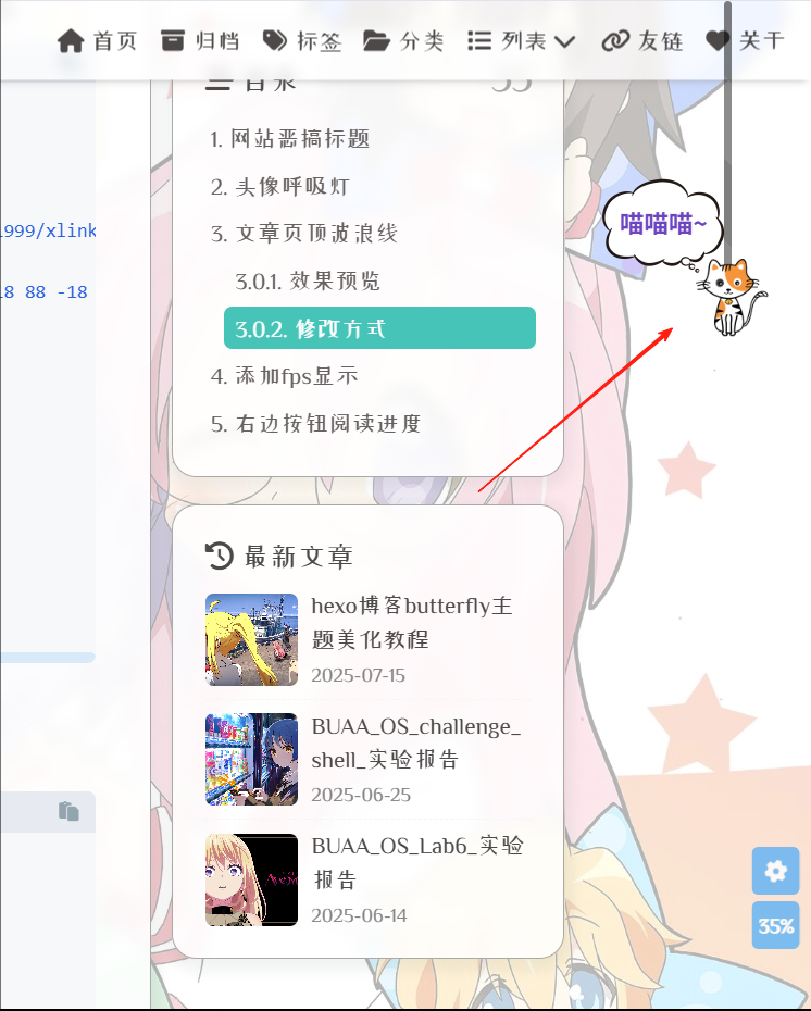
绳子的缩放进度会随着浏览进度同步变化,点击猫咪即可回到页顶
修改方式
制作一个盛放内容的盒子,在
[BlogRoot]\themes\butterfly\layout\includes\head.pug的最后一行加上这样的代码1
#myscoll
其实随便放在哪里都是可以的,只要能加载出来就行在
[BlogRoot]\themes\butterfly\source\js下新建文件cat.js,将以下代码复制到文件中1
2
3
4
5
6
7
8
9
10
11
12
13
14
15
16
17
18
19
20
21
22
23
24
25
26
27
28
29
30
31
32
33
34
35
36
37
38
39
40
41
42
43
44
45
46
47
48
49
50
51
52
53
54
55
56
57
58
59
60
61
62
63
64
65
66
67
68
69
70
71
72
73
74
75
76
77
78
79
80
81
82
83
84
85
86
87
88
89
90
91
92
93
94
95
96
97
98
99
100
101
102
103
104
105
106
107
108
109
110
111
112
113
114
115
116
117
118
119
120
121
122
123
124
125
126
127
128if (document.body.clientWidth > 992) {
function getBasicInfo() {
/* 窗口高度 */
var ViewH = $(window).height();
/* document高度 */
var DocH = $("body")[0].scrollHeight;
/* 滚动的高度 */
var ScrollTop = $(window).scrollTop();
/* 可滚动的高度 */
var S_V = DocH - ViewH;
var Band_H = ScrollTop / (DocH - ViewH) * 100;
return {
ViewH: ViewH,
DocH: DocH,
ScrollTop: ScrollTop,
Band_H: Band_H,
S_V: S_V
}
};
function show(basicInfo) {
if (basicInfo.ScrollTop > 0.001) {
$(".neko").css('display', 'block');
} else {
$(".neko").css('display', 'none');
}
}
(function ($) {
$.fn.nekoScroll = function (option) {
var defaultSetting = {
top: '0',
scroWidth: 6 + 'px',
z_index: 9999,
zoom: 0.9,
borderRadius: 5 + 'px',
right: 60 + 'px',
nekoImg: "https://bu.dusays.com/2022/07/20/62d812db74be9.png",
hoverMsg: "喵喵喵~",
color: "#6f42c1",
during: 500,
blog_body: "body",
};
var setting = $.extend(defaultSetting, option);
var getThis = this.prop("className") !== "" ? "." + this.prop("className") : this.prop("id") !== "" ? "#" +
this.prop("id") : this.prop("nodeName");
if ($(".neko").length == 0) {
this.after("<div class=\"neko\" id=" + setting.nekoname + " data-msg=\"" + setting.hoverMsg + "\"></div>");
}
let basicInfo = getBasicInfo();
$(getThis)
.css({
'position': 'fixed',
'width': setting.scroWidth,
'top': setting.top,
'height': basicInfo.Band_H * setting.zoom * basicInfo.ViewH * 0.01 + 'px',
'z-index': setting.z_index,
'background-color': setting.bgcolor,
"border-radius": setting.borderRadius,
'right': setting.right,
'background-image': 'url(' + setting.scImg + ')',
'background-image': '-webkit-linear-gradient(45deg, rgba(255, 255, 255, 0.1) 25%, transparent 25%, transparent 50%, rgba(255, 255, 255, 0.1) 50%, rgba(255, 255, 255, 0.1) 75%, transparent 75%, transparent)', 'border-radius': '2em',
'background-size': 'contain'
});
$("#" + setting.nekoname)
.css({
'position': 'fixed',
'top': basicInfo.Band_H * setting.zoom * basicInfo.ViewH * 0.01 - 50 + 'px',
'z-index': setting.z_index * 10,
'right': setting.right,
'background-image': 'url(' + setting.nekoImg + ')',
});
show(getBasicInfo());
$(window)
.scroll(function () {
let basicInfo = getBasicInfo();
show(basicInfo);
$(getThis)
.css({
'position': 'fixed',
'width': setting.scroWidth,
'top': setting.top,
'height': basicInfo.Band_H * setting.zoom * basicInfo.ViewH * 0.01 + 'px',
'z-index': setting.z_index,
'background-color': setting.bgcolor,
"border-radius": setting.borderRadius,
'right': setting.right,
'background-image': 'url(' + setting.scImg + ')',
'background-image': '-webkit-linear-gradient(45deg, rgba(255, 255, 255, 0.1) 25%, transparent 25%, transparent 50%, rgba(255, 255, 255, 0.1) 50%, rgba(255, 255, 255, 0.1) 75%, transparent 75%, transparent)', 'border-radius': '2em',
'background-size': 'contain'
});
$("#" + setting.nekoname)
.css({
'position': 'fixed',
'top': basicInfo.Band_H * setting.zoom * basicInfo.ViewH * 0.01 - 50 + 'px',
'z-index': setting.z_index * 10,
'right': setting.right,
'background-image': 'url(' + setting.nekoImg + ')',
});
if (basicInfo.ScrollTop == basicInfo.S_V) {
$("#" + setting.nekoname)
.addClass("showMsg")
} else {
$("#" + setting.nekoname)
.removeClass("showMsg");
$("#" + setting.nekoname)
.attr("data-msg", setting.hoverMsg);
}
});
this.click(function (e) {
btf.scrollToDest(0, 500)
});
$("#" + setting.nekoname)
.click(function () {
btf.scrollToDest(0, 500)
});
return this;
}
})(jQuery);
$(document).ready(function () {
//部分自定义
$("#myscoll").nekoScroll({
bgcolor: 'rgb(0 0 0 / .5)', //背景颜色,没有绳子背景图片时有效
borderRadius: '2em',
zoom: 0.9
}
);
})
}在
[BlogRoot]\source\css\custom.css中添加如下代码1
2
3
4
5
6
7
8
9
10
11
12
13
14
15
16
17
18
19
20
21
22
23
24
25
26
27
28
29
30
31
32
33
34
35
36
37
38
39
40
41
42
43
44
45
46
47
48
49
50
51
52
53
54
55
56
57
58
59
60
61
62
63
64
65
66
67
68
69
70
71
72
73
74
75
76
77body::-webkit-scrollbar {
width: 0;
}
.neko {
width: 64px;
height: 64px;
background-image: url("https://bu.dusays.com/2022/07/20/62d812db74be9.png");
position: absolute;
right: 32px;
background-repeat: no-repeat;
background-size: contain;
transform: translateX(50%);
cursor: pointer;
font-family: tzy;
font-weight: 600;
font-size: 16px;
color: #6f42c1;
display: none;
}
.neko::after {
display: none;
width: 100px;
height: 100px;
background-image: url("https://bu.dusays.com/2022/07/20/62d812d95e6f5.png");
background-size: contain;
z-index: 9999;
position: absolute;
right: 50%;
text-align: center;
line-height: 100px;
top: -115%;
}
.neko.showMsg::after {
content: attr(data-msg);
display: block;
overflow: hidden;
text-overflow: ellipsis;
}
.neko:hover::after {
content: attr(data-msg);
display: block;
overflow: hidden;
text-overflow: ellipsis;
}
.neko.fontColor::after {
color: #333;
}
/**
* @description: 滚动条样式 跟猫二选一
*/
@media screen and (max-width:992px) {
::-webkit-scrollbar {
width: 8px ;
height: 8px
}
::-webkit-scrollbar-track {
border-radius: 2em;
}
::-webkit-scrollbar-thumb {
background-color: rgb(255 255 255 / .3);
background-image: -webkit-linear-gradient(45deg, rgba(255, 255, 255, 0.1) 25%, transparent 25%, transparent 50%, rgba(255, 255, 255, 0.1) 50%, rgba(255, 255, 255, 0.1) 75%, transparent 75%, transparent);
border-radius: 2em
}
::-webkit-scrollbar-corner {
background-color: transparent
}
}在
_config.butterfly.yml中引入cat.js,还要在bottom的最前面引入jQuery,因为cat.js的语法依赖jQuery1
2
3
4
5
6inject:
head:
- <link rel="stylesheet" href="/css/cat.css">
bottom:
- <script defer src="https://npm.elemecdn.com/jquery@latest/dist/jquery.min.js"></script>
- <script defer data-pjax src="/js/cat.js"></script>最后重启项目即可观察到效果。
自定义字体
声明:非商免字体未经授权仅限个人使用,不得用于商业用途!
效果预览
修改方式
准备好字体文件之后,在
[BlogRoot]\source\css\custom.css中添加如下代码1
2
3
4
5
6
7
8
9
10
11
12@font-face {
/* 为载入的字体取名字(随意) */
font-family: 'msz';
/* 字体文件地址(相对或者绝对路径都可以) */
src: url(/font/ZCOOLXiaoWei-Regular.ttf);
/* 定义加粗样式(加粗多少) */
font-weight: normal;
/* 定义字体样式(斜体/非斜体) */
font-style: normal;
/* 定义显示样式 */
font-display: block;
}各个属性的定义:
font-family属性值中使用webfont来声明使用的是服务器端字体,即设置文本的字体名称。src属性值中首先指定了字体文件所在的路径。format声明字体文件的格式,可以省略文件格式的声明,单独使用src属性值。font-style:设置文本样式。取值:normal:不使用斜体;italic:使用斜体;oblique:使用倾斜体;inherit:从父元素继承。- 支持格式:
*.eot(老版本IE),*.otf,*.ttf,*.woff,*.woff2(推荐)
在主题配置文件
_config.butterfly.yml中的font配置项以及blog_title_font配置项写上你刚刚引入的字体名称,系统会根据先后次序从前到后依次加载这些字体1
2
3
4
5
6
7
8
9font:
global-font-size: '15px'
code-font-size: '14px'
font-family: msz, var(--global-font), Consolas_1, -apple-system, 'Quicksand', 'Nimbus Roman No9 L', 'PingFang SC', 'Hiragino Sans GB', 'Noto Serif SC', 'Microsoft Yahei', 'WenQuanYi Micro Hei', 'ST Heiti', sans-serif;
code-font-family: Consolas_1, var(--global-font), "Microsoft YaHei", Menlo, "PingFang SC", "Microsoft JhengHei", sans-serif
blog_title_font:
font_link:
font-family: msz, var(--global-font)最后重启项目即可
个人卡片渐变色
效果预览
给自己的个人卡片加上一个动态的渐变效果
修改方式
在 [BlogRoot]\source\css\custom.css 自定义样式的文件中引入如下代码(最后记得在 inject 配置项引入!!!)
1 | /* 侧边栏个人信息卡片动态渐变色 */ |
写在最后
这部分魔改基本上都是大佬们造好的轮子,我按照大佬们的轮子结合自己的喜好进行魔改的。如果有侵权的话可以联系删除。
希望大家也能拥有一个自己喜欢的博客网站~
🥰🥰🥰


